The social group I am planning to attract are 16-19 year old male and females, interested in the genre of Pop. To do this I have used specific devices.
Firstly, in my Masthead 'LIMITED' I flipped around the D turning into slang which makes it apply to teenagers, as slang terms are frequently used by that age group. CLICK HERE to view my Masthead.
My pictures also represented my aimed social class, for 16 - 17 year old teenage girls, with their own individual style. The clothes they were wearing represented their own individuality, expressing themselves rather than a stereotypical Pop group. Due to this, teenage girls themselves will be able to link themselves with the girl band, meaning it is more likely to grab their attention making them more likely to purchase the magazine. Furthermore, as I wanted my social group to include males, I believe that having females on the cover will be more persuasive for them to buy than having males on the front, as they may feel that this would question their sexuality, and 16-19 year old boys are also very interested in females.
In contrast, Top of the Pops magazine more frequently uses males on the cover, in order to attract female attention rather than males. This is due to their 'celebrity crush' appearing in the magazine, meaning they want to read on.
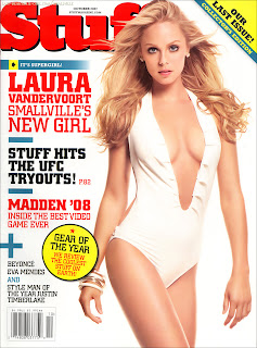
For instance, all magazines aimed at just males usually have women showing their bodies on the cover, as publishers believe this is want they want.
This 'Lads Mag' shows a women revealing flesh. However, I believe this isn't necessary to draw in males. I was trying to create something that appeals to them rather than using women as Sex Symbols. Therefore, I used devices such as typography, images, lures and cover lines which also appeal to them.
Click HERE for an example of a Top of the Pops front cover.


No comments:
Post a Comment